
CASE STUDY — 2020

Mercedes-Benz
Build Your Own
About the Project
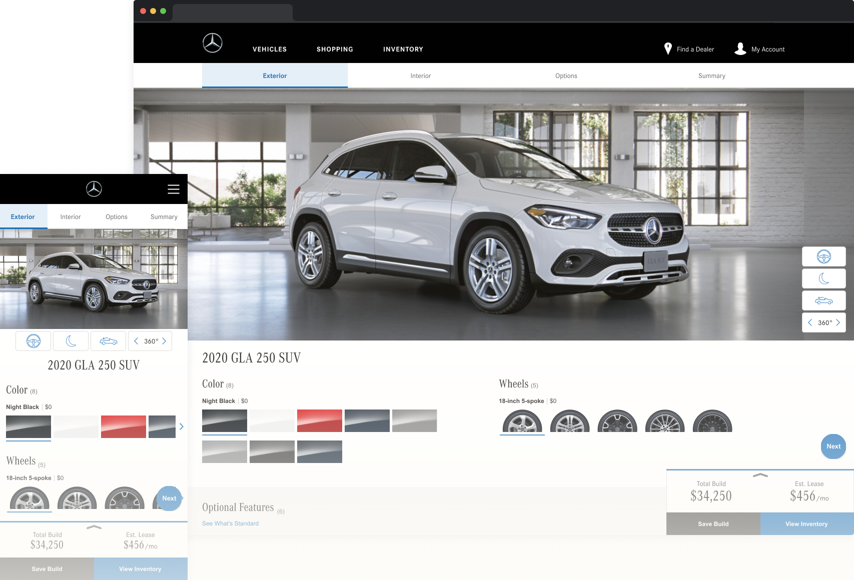
Mercedes-Benz of North America hosts a responsive Build Your Own tool which enables users to configure their dream vehicles via its websites. The goal was not to reimagine the BYO tool yet to design incremental enhancements released in multiple phases.
My role
A Lead designer through the end-to-end process: discovery, user research, requirements, design, testing, and support through the launch
Team
Wayne Fujita — Group Creative Director
Ji Park — Senior Experience Designer
Goals
The business goals of this project were to increase engagements with the Build Your Own tool and lead form submissions.
Primary KPIs
Funnel shoppers to shop for vehicles on the New Inventory page
Secondary KPIs
Reaching the summary page
Saving builds
Starting any other lead forms (schedule a test drive, request a quote, etc.)
The Problem
Before jumping directly to the project, we had to identify the problems – by researching what the current shoppers are doing with the BYO tool, who these shoppers are, what their issues with the current BYO tool are, and most importantly, what the shoppers’ goals and needs are. Luckily, our internal data analytic team enabled us to track the users’ behaviors.
UX Data Analysis
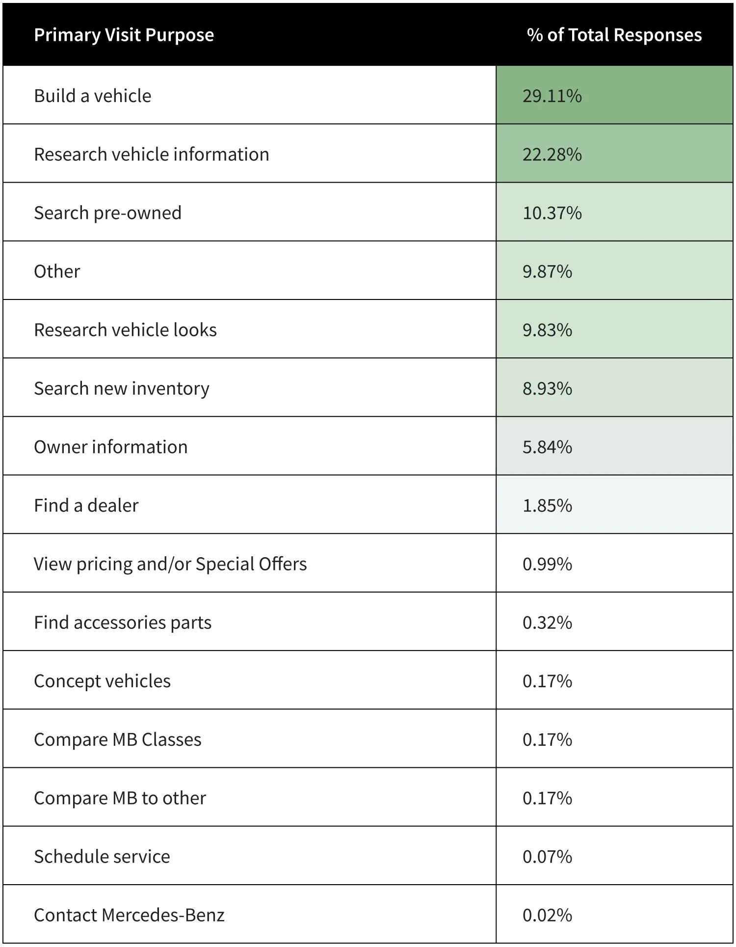
The main purpose of the BYO tool
The data shows that 11.8mm users started Build last year and 6.3mm users completed Build. The majority of users used the BYO tool to build a vehicle.
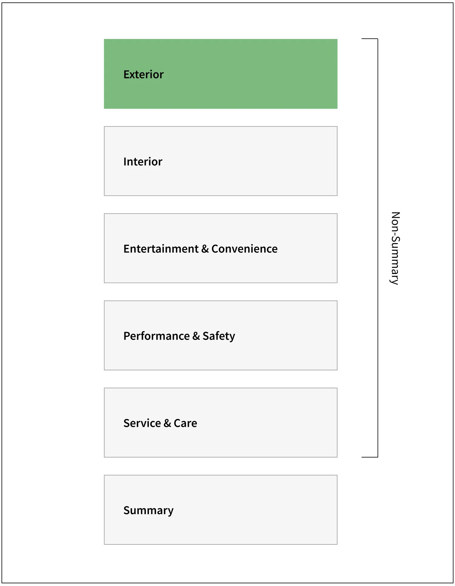
The most used feature
Based on the data, most users only customize the exterior colors. The second most popular category is wheels which is also accessed from the exterior.
The primary destinations
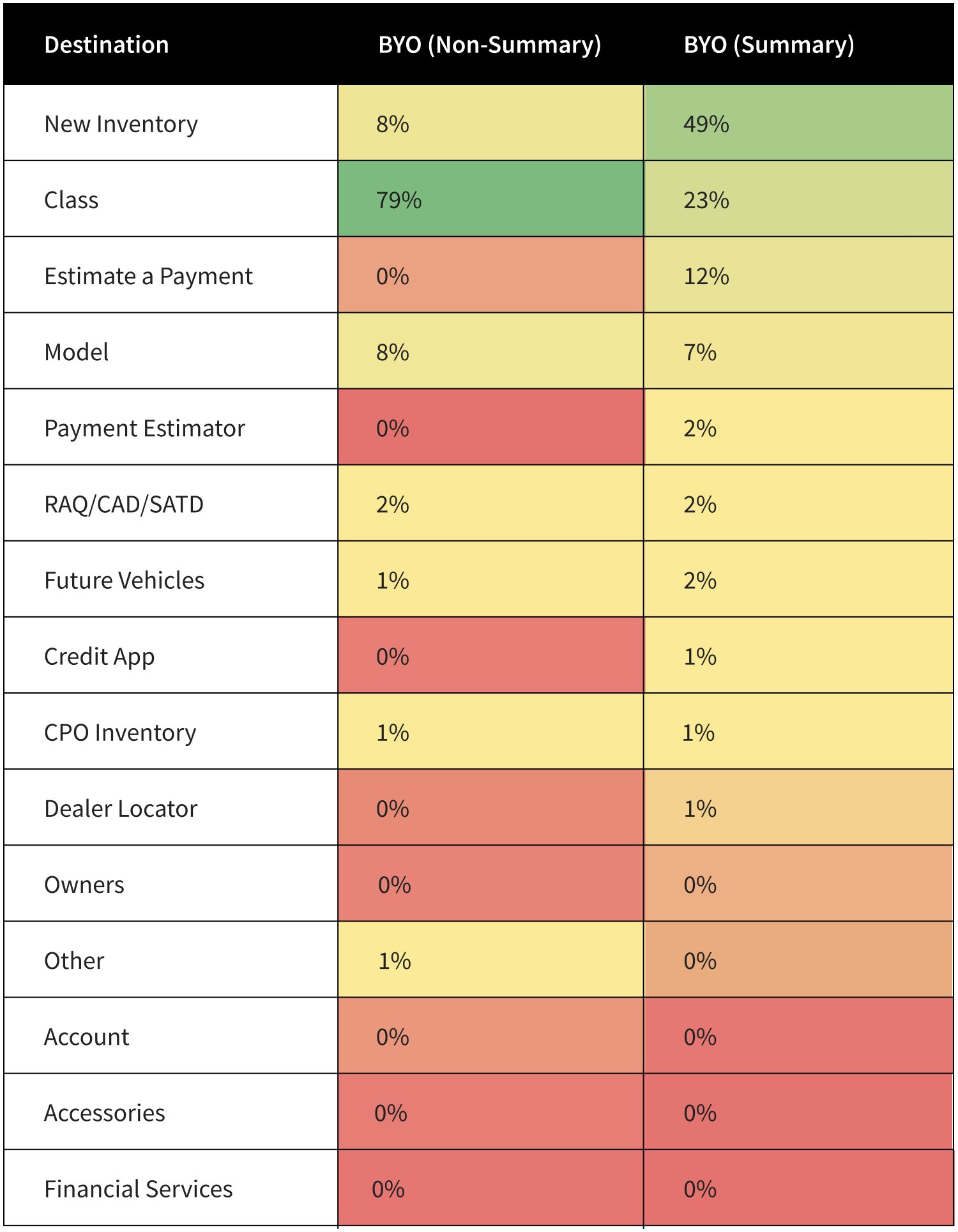
From the non-summary journey, 79% of users went to Class pages the most. The users who reached summary, which was 49%, visited New Inventory pages.
Interesting fact from the data
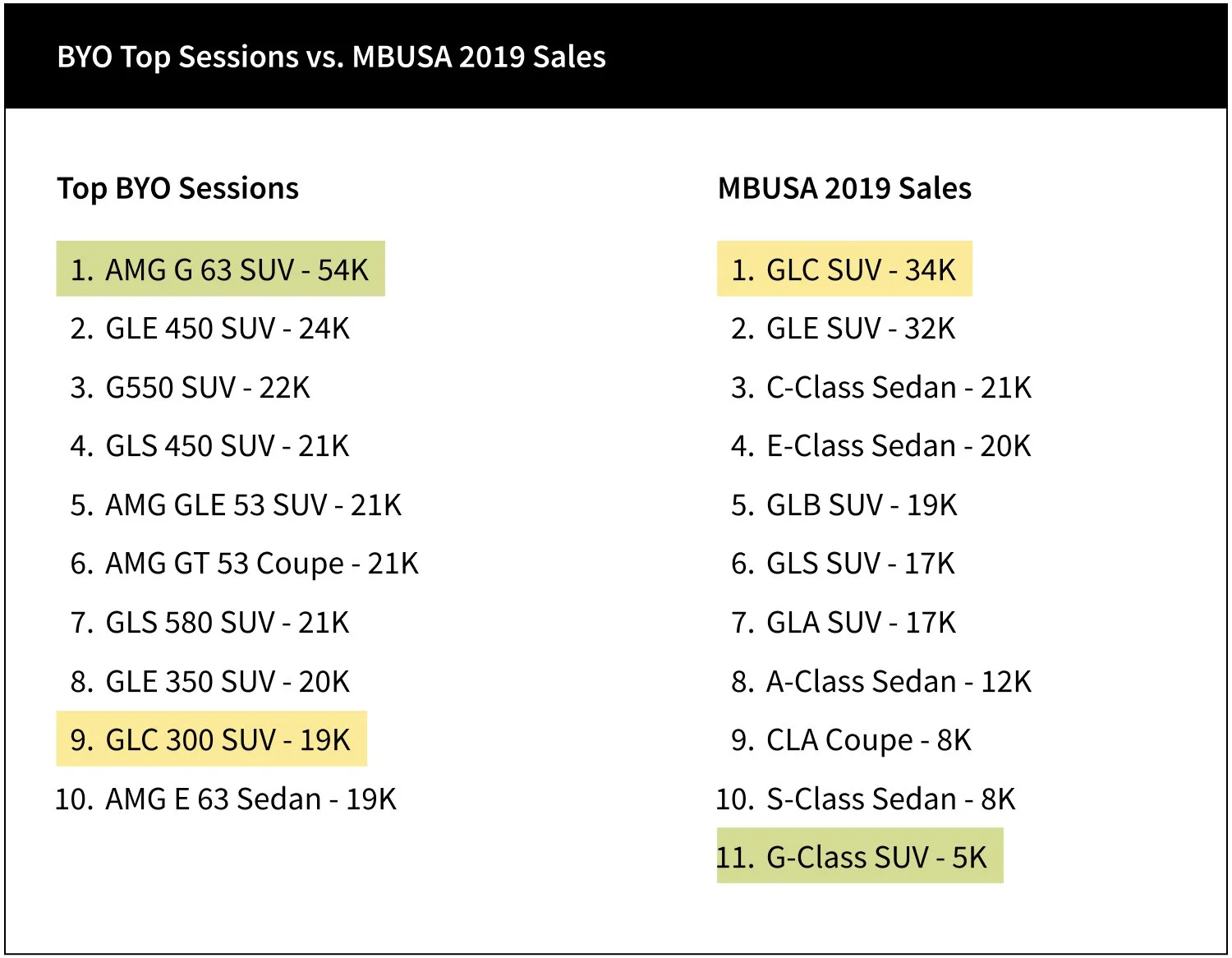
It was eye-opening to learn the fact that the order of vehicle models that were built the most doesn’t match the order of vehicle models that were sold.
Current Audience
Mid 66% of sales funnel, shopping mainly
Middle-of-funnel - comparison and analysis of cars
Customers are browsing within a brand and comparing classes and models
Providing ways to encourage engaging with a dealer
KPI: inventory searches
Breakdown of audience
Dreamers - based on BYO sessions vs. 2019 sales data
Shoppers who are looking to purchase a vehicle
So We Finally Identified the Problems!
Difficult time with decision-making
Too many packages and options to choose from.
Non-factory options such as accessories and service & care options seem excessive.
Plausibility rules are common and deter shoppers from continuing their build.
Lack of guidance and unclear on the next steps.
The vehicle is not the main attraction
The total build summary module covers the vehicle.
Shoppers lack the opportunity to view their build in various views.
Lack of vehicle information which is causing significant drop-off.
Design Process
UX Challenges
The primary challenge is to provide enhancements that will simplify the vehicle configurator experience that guides shoppers to make confident choices to get them to purchase their next vehicle. The secondary challenge is to tactically drive shoppers to reach the summary page and drive them to view local inventory along with secondary actions (save your build, request a quote, estimate a payment, and apply for credit).
UX Goals
Simple
Create simple interactions that decrease friction so that shoppers can focus.
Confident
Inspire shoppers to learn, explore and configure vehicles that help guide them to make confident choices.
Seamless
Seamless and timely feedback should be included that feel natural and provide shoppers with the assurance the tool is working.
Be human
Be human by including simple, non-jargon information to help aid shoppers in their journey. Always provide a clear next steps and be transparent.
Whiteboarding
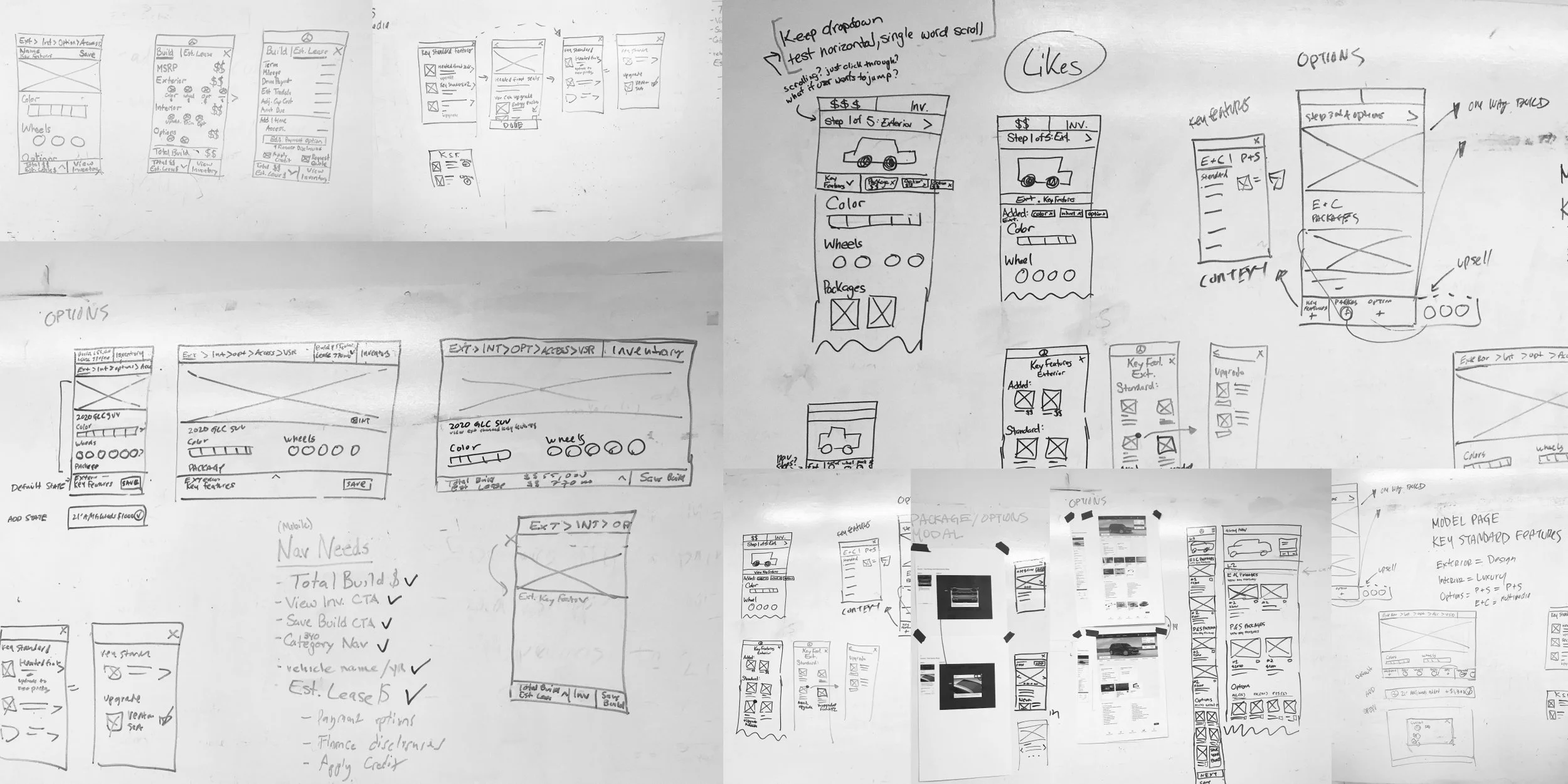
During the whiteboarding session, we explored navigation patterns, solutions to help shoppers to make confident choices, ways to guide them to summary.
User Testing
10 Participants
We wanted to evaluate how people navigate to complete specific tasks.
Observe how shoppers engage with content related to accessories, packages, and options.
Identifying any critical issues and expectations with the Total Build Summary module, Inventory Matches, and Save Your Build functionality.
Prototype 1
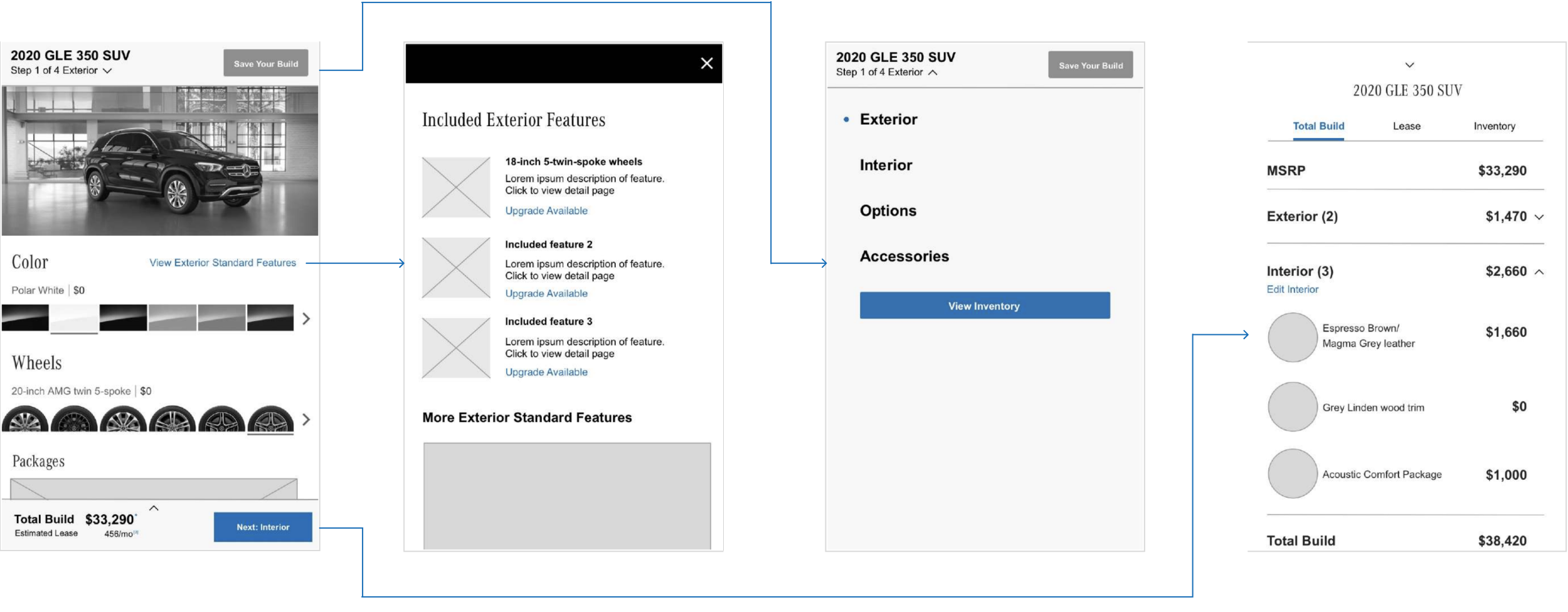
Prototype 2
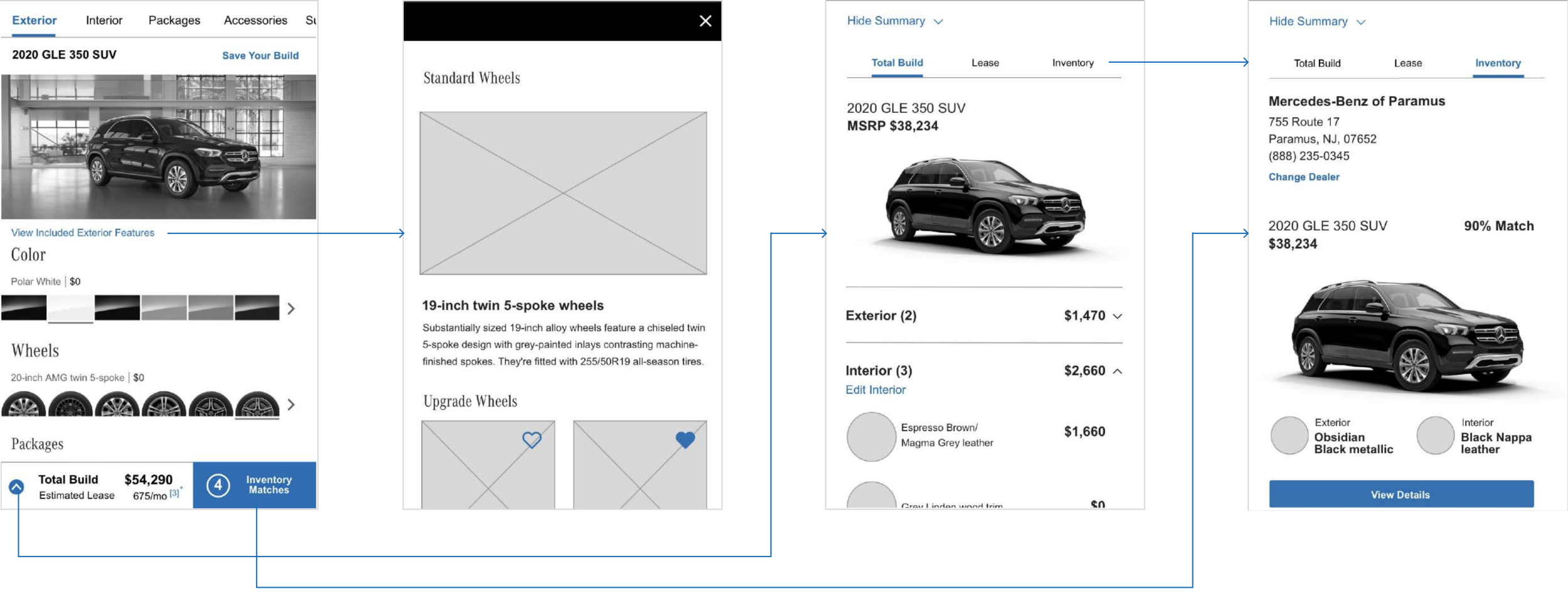
Overall, participants navigated the BYO flow successfully.
Received positive feedback on brevity of flow and the tab navigation tested better.
More than 50% of the participants used the next button to accomplish their tasks.
Total Build Module
Many mentioned that not everyone likes to lease vehicles.
Many wanted to share their builds with friends & family.
BYO Content
100% of participants wanted to know what was standard with the vehicle.
Many mentioned that they would haggle with dealers on accessories.
Inventory Matches
Participants thought the number of matches meant how many vehicles were left in inventory.
Some were upset that they were pushing vehicles on them when they weren’t ready to purchase.
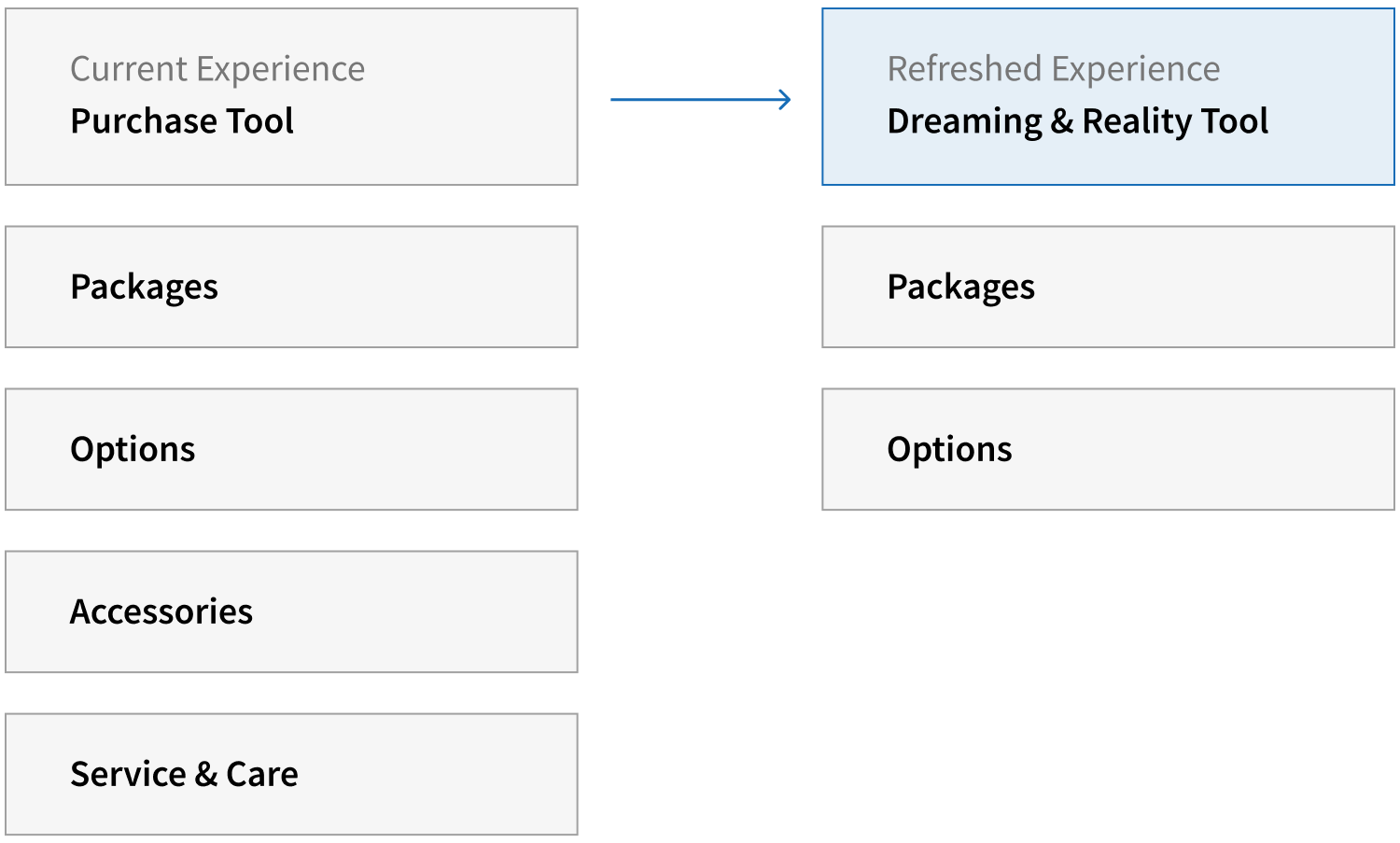
The Shift
UI Design
How did we solve the problems for shoppers?
The primary UX challenge is to provide enhancements that will simplify the vehicle configurator experience that guides shoppers to make confident choices to get them to purchase their next vehicle. The secondary challenge is to tactically drive shoppers to reach the summary page and drive them to view local inventory along with secondary actions (save your build, request a quote, estimate a payment, and apply for credit).
BYO: Landing
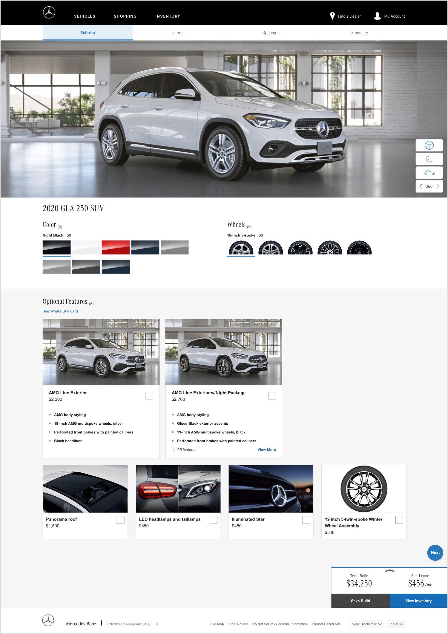
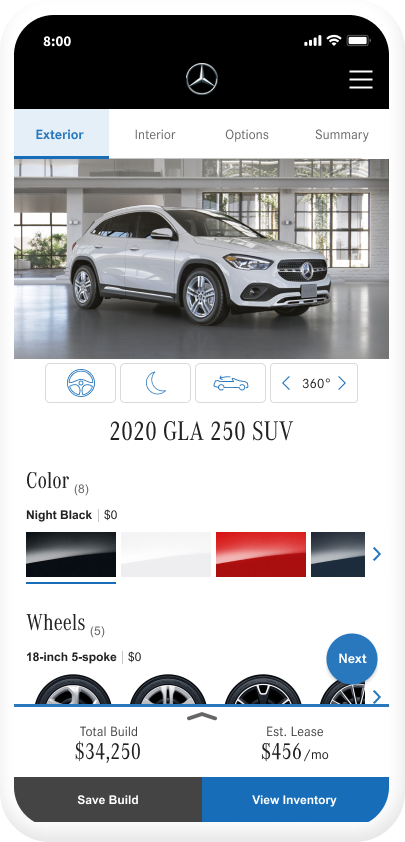
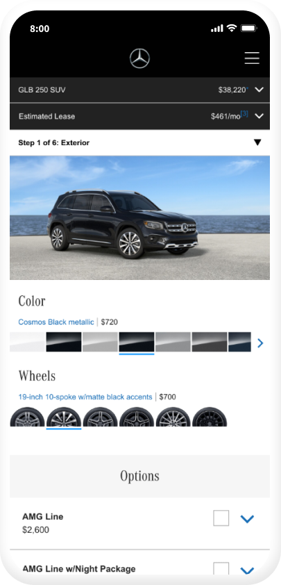
Updated Options & Swatches
All category options now include total number of available options and larger swatches.
Package Thumbnails
Allows customers to quickly view and compare the differences in packages.
Optional Features
Updated the language to be more direct and clear. A link to view what’s standard allows customers to understand what’s included in the vehicles. This will help guide them in making better decisions on what options to add to their builds.
Mobile
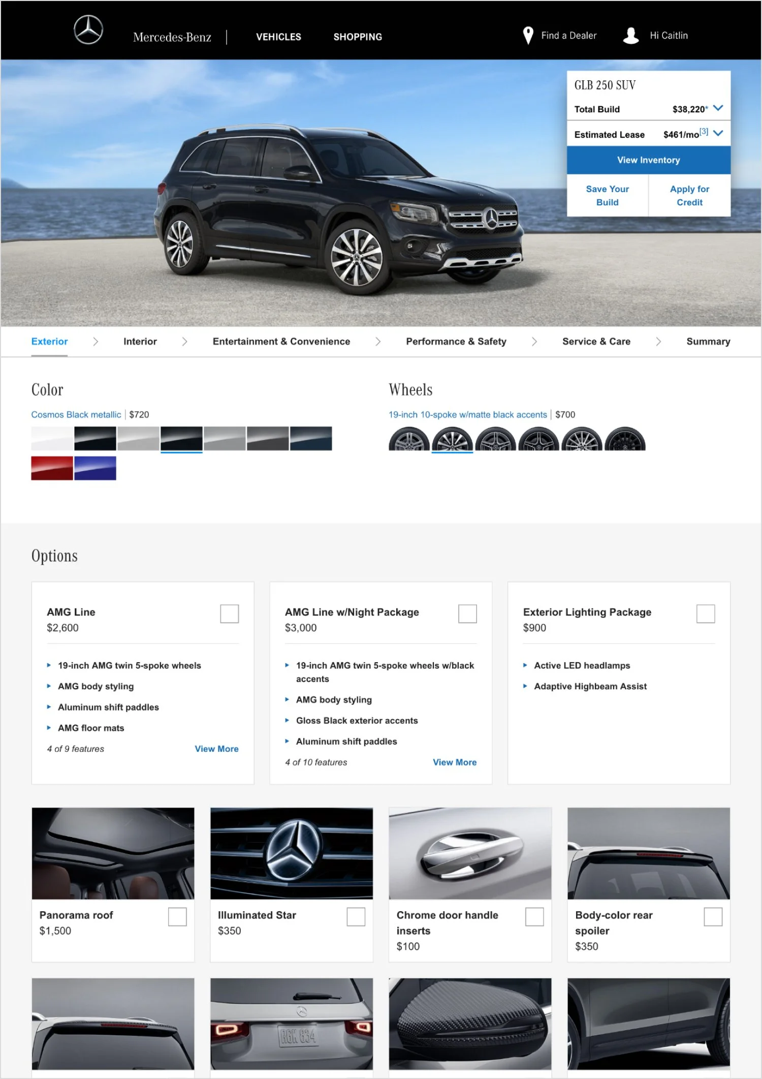
Before
Mobile
After
Desktop
Before
Desktop
After
BYO: Options Tab
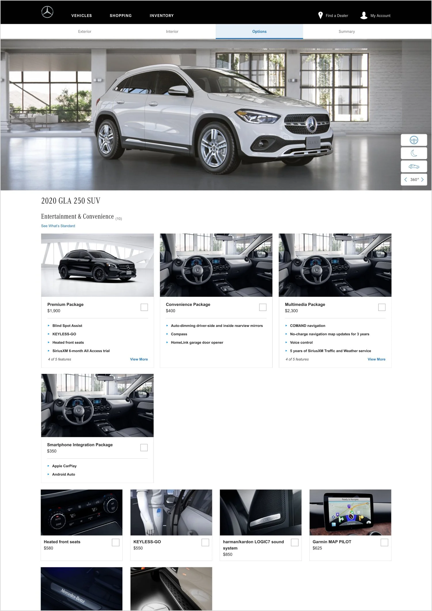
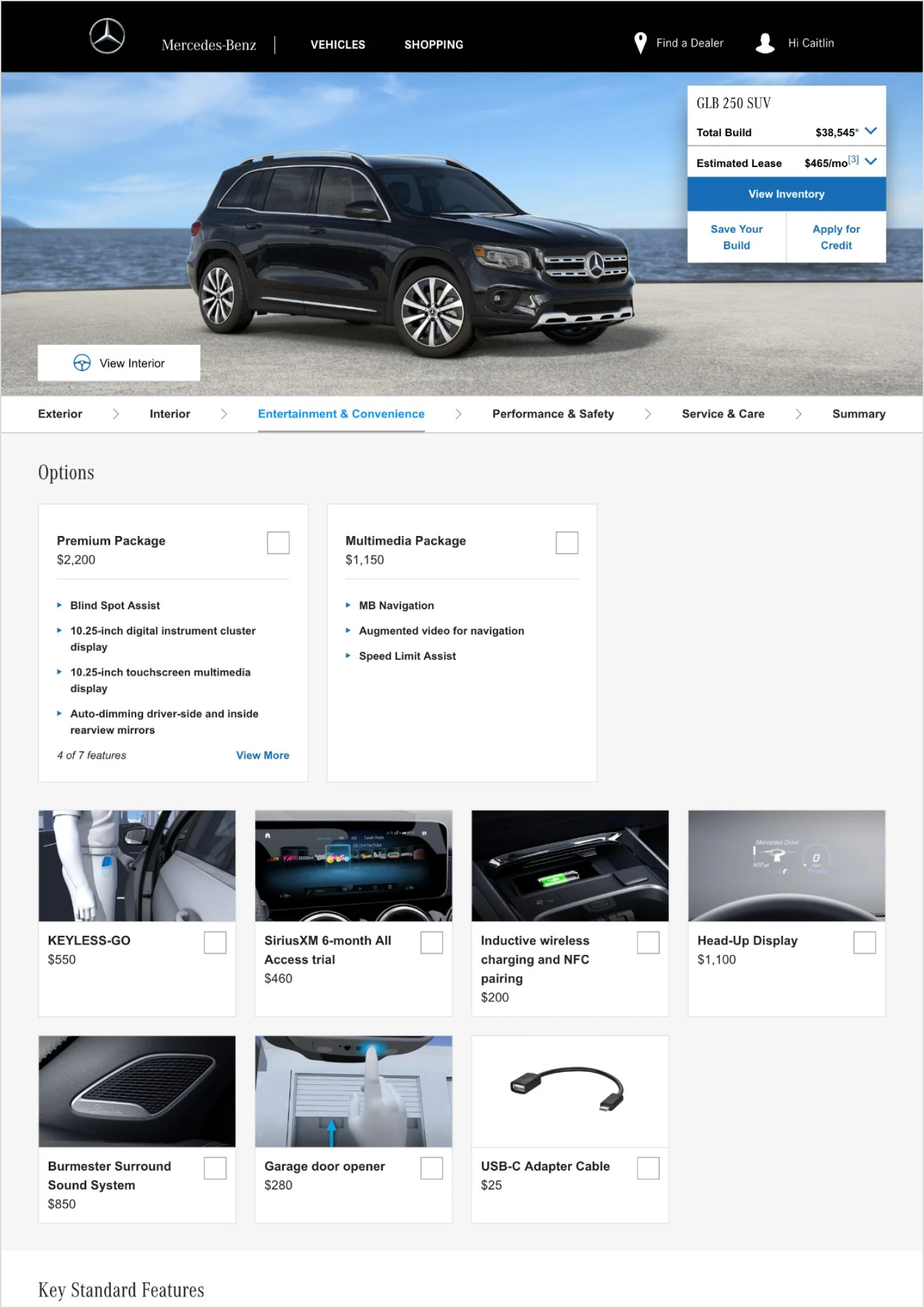
Consolidated Options Category
Combined Entertainment & Convenience and Performance & Safety options to streamline the BYO flow. Viewing all options in one place allows them to make quick comparisons and better decision-making.
Desktop
Before
Desktop
After
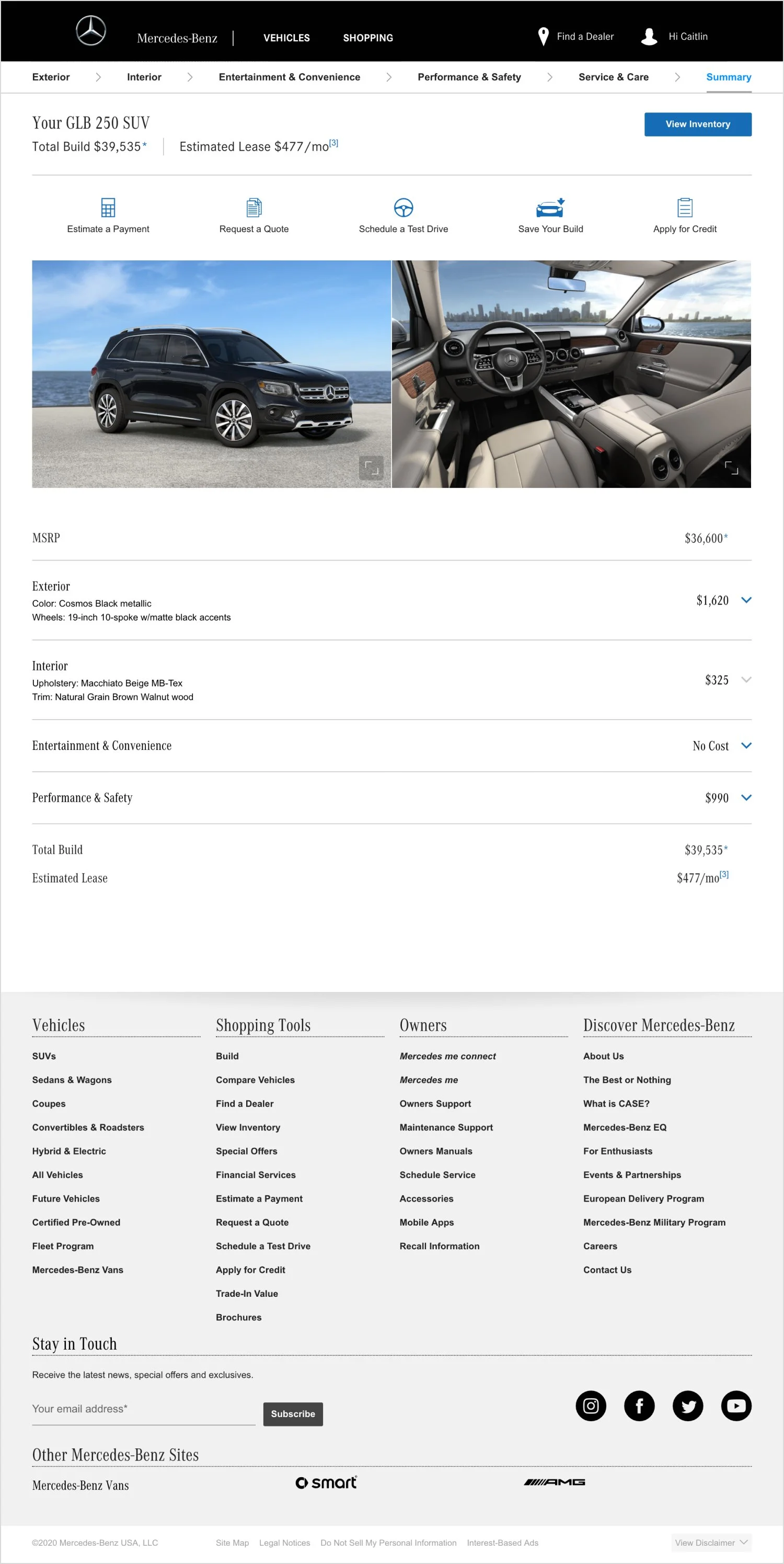
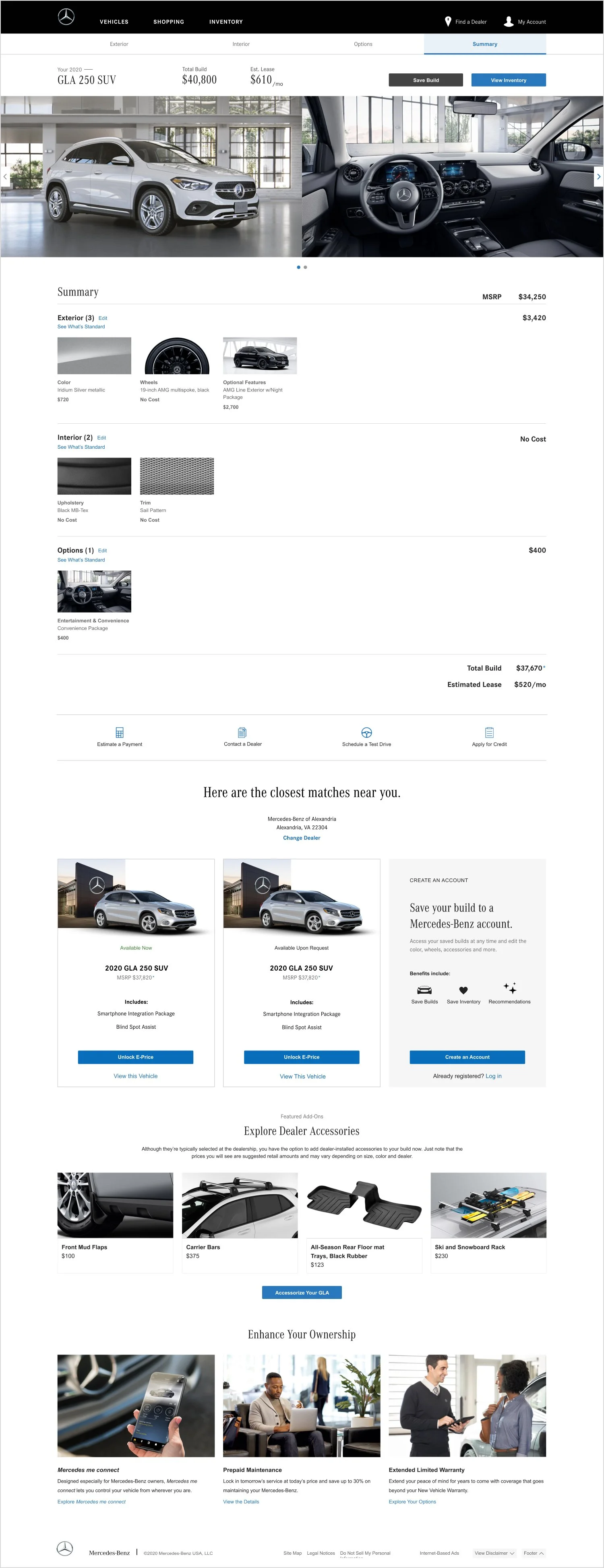
BYO: Summary Tab
Total Build
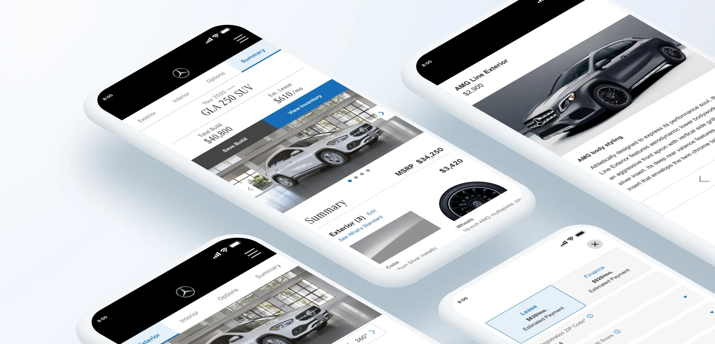
With total build & leasing estimate pricing displayed more prominently, this would help provide more focus on the primary CTAs.
Visual Oriented Summary
The updated look and feel of the summary page was designed to give shoppers more confidence and control with their selections.
The addition of thumbnails provides a visual way to quickly know what options they’ve added and being able to edit allows for instant changes.
Secondary Actions
These secondary actions have been moved below the summary to provide immediate next steps for shoppers.
Personalized Inventory Matches
Displaying inventory matches based on their builds gets shoppers one step closer to inventory.
Accessories / Service & Care
Provides next steps for shoppers to explore additional options.
Desktop
Before
Desktop
After
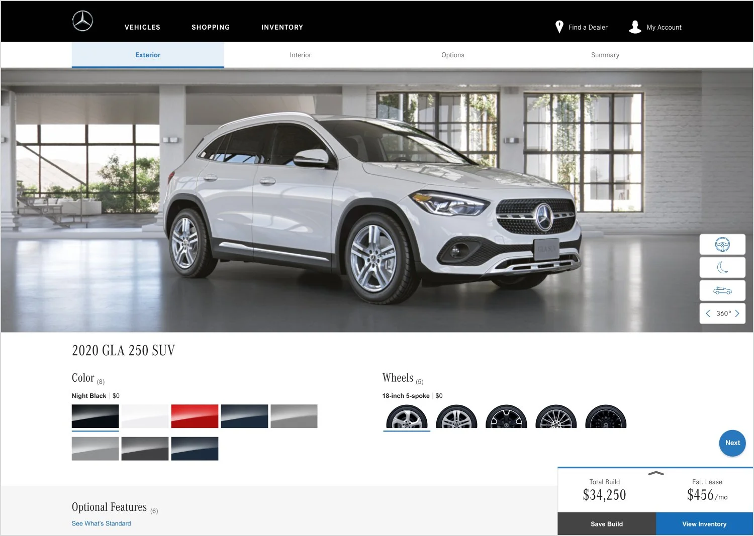
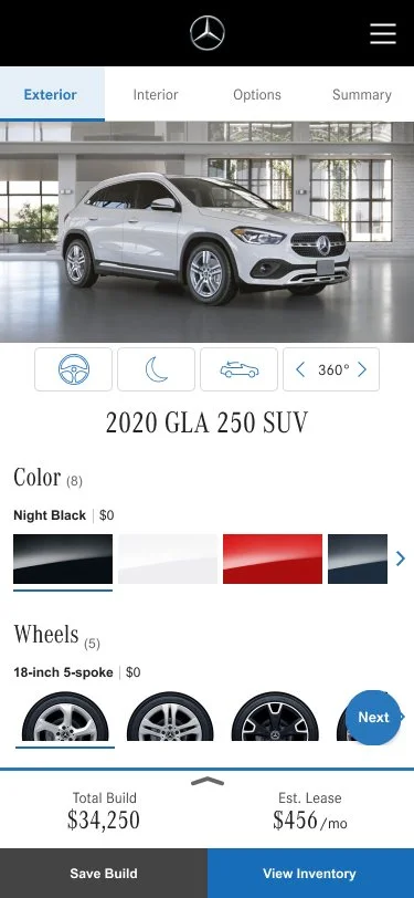
Total Build Module
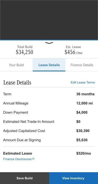
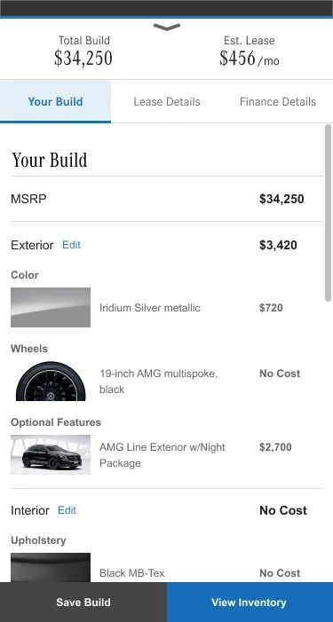
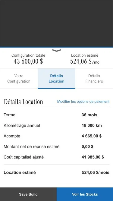
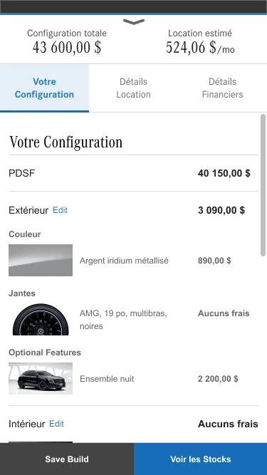
This persistent expandable module allows shoppers to quickly access their total build summary and lease/financing options. The next CTA provides shoppers with an instant way to make progress.
Total Build Module Expanded
Quickly view your build summary and payment estimator at any moment of the your build.
Mobile
Desktop
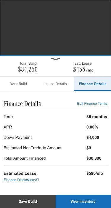
“Finance Details“ Tab
“Lease Details“ Tab
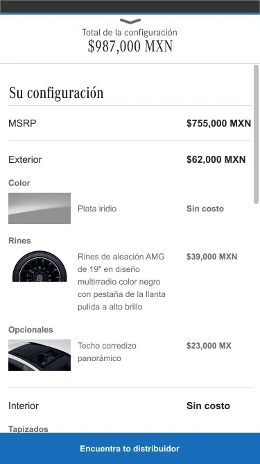
“Build Summary“ Tab
Localization
We had to create a template that works perfectly for three different countries — U.S., Canada, and Mexico — which means three different languages as well, English, French, and Spanish.
Outcome
The refreshed BYO experience resulted in more save builds and inventory visits. The business goals were successfully achieved in results of :
Reached Summary Page
+ 6%
Reached Summary Page Saved Builds
+ 75%
Inventory Visits