REDESIGN WEBSITE, DESIGN SYSTEM — 2017

Walmart

A dark blue gradient background.
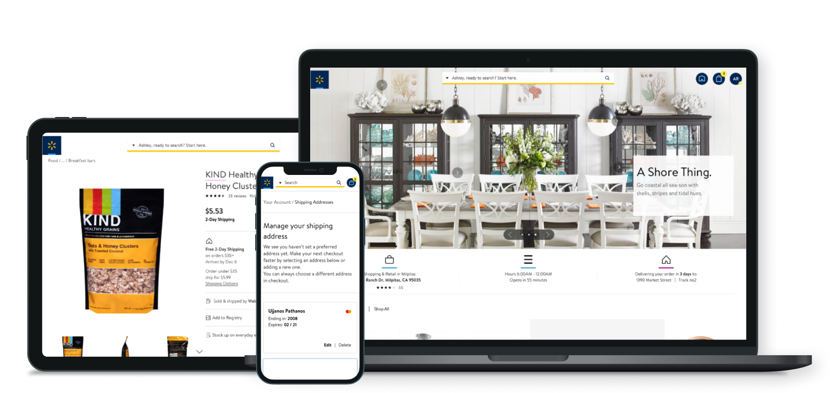
Laptop, tablet, and smartphone displaying Walmart online shopping website with a dining room image, food item, and shopping options on screens.

About the Project

The objective of this project was to deliver a new online shopping experience that was faster and easier than what existed. To do so, we created a single pattern library on Sketch and successfully applied a new design direction across all of Walmart.com.

My role

As a senior designer, I delivered comps utilizing the Sketch Library under the creative directors’ supervision.

Team

Graham Golkin — Creative Director
Torsten Rothbarth —Associate Creative Director
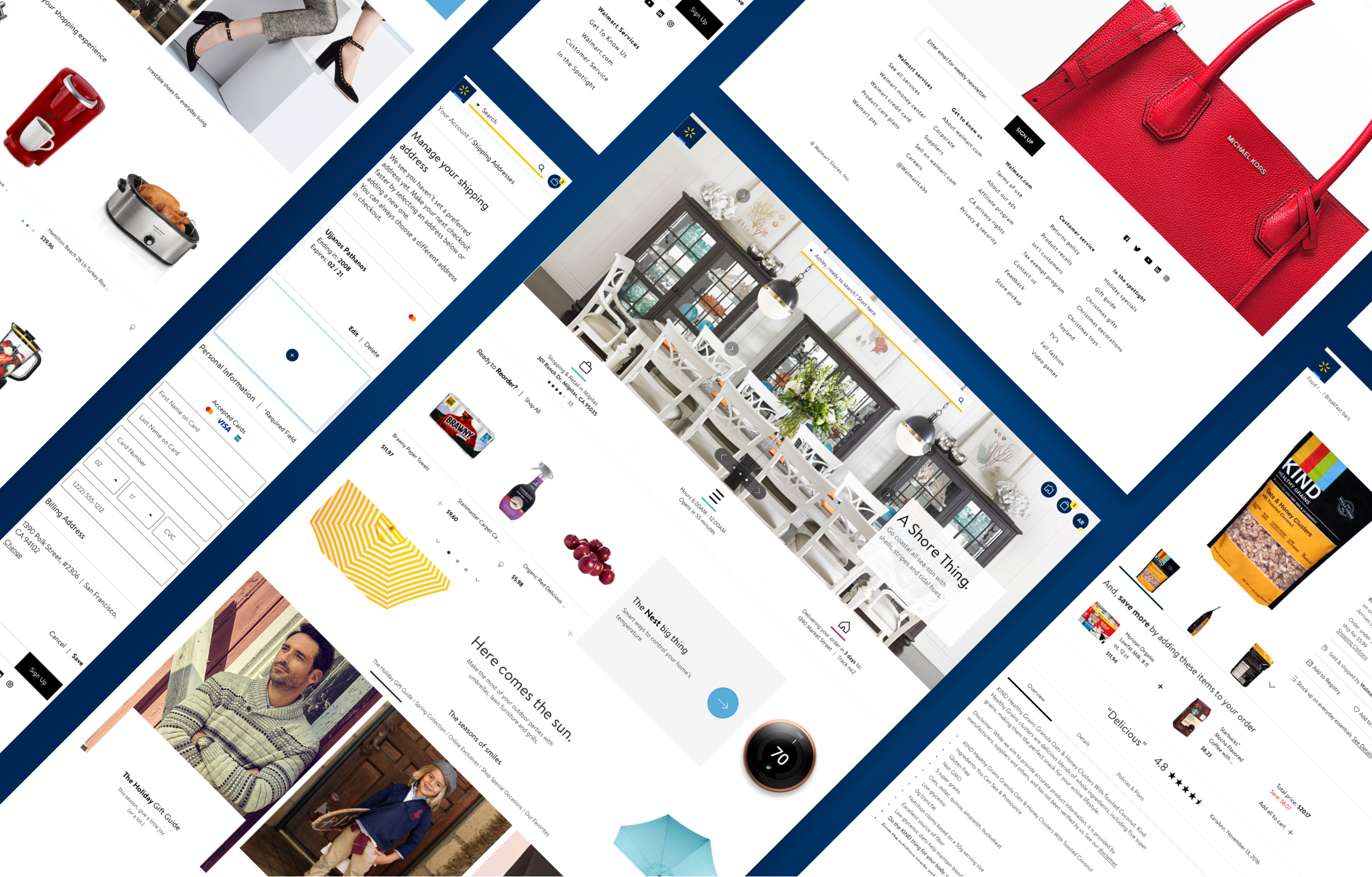
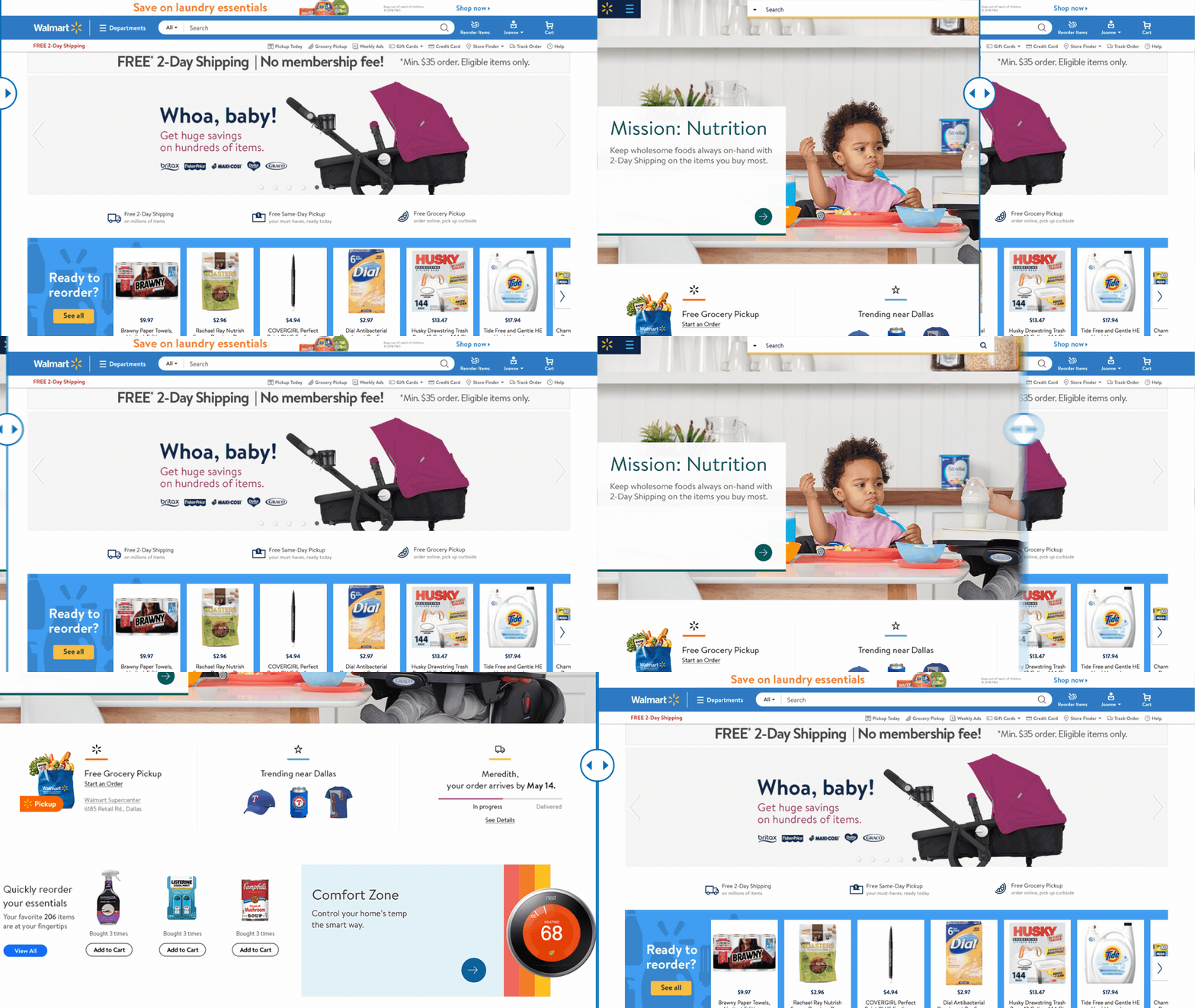
A collage of various digital screens displaying online shopping websites, product images, and shopping interfaces with a blue and white color theme.

Sketch Pattern Library

By using a single Sketch pattern library, we were able to establish consistent usage of the new Walmart style, including typography, colors, icons, and other components.
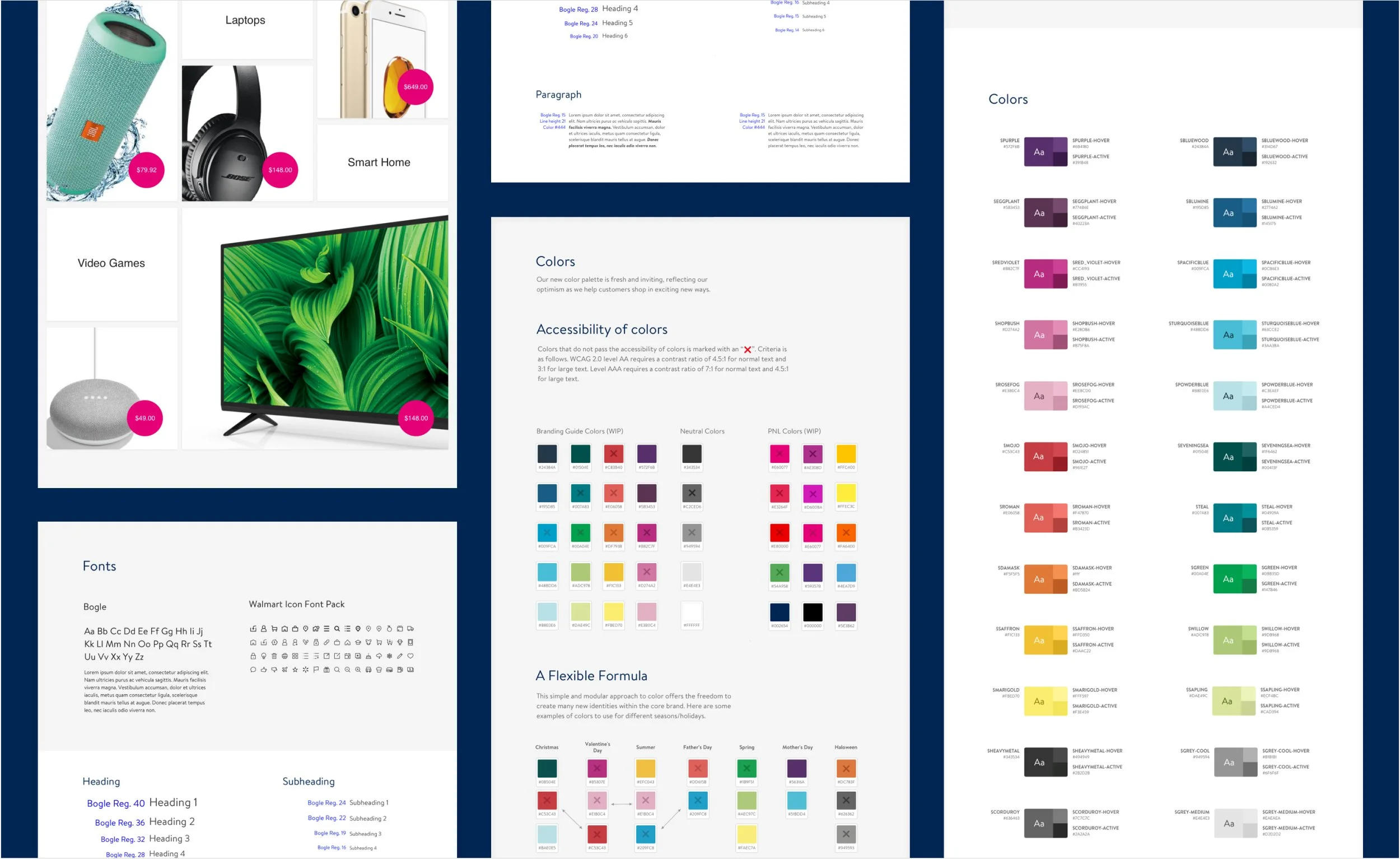
A digital style guide or color palette document containing various sections with headings, paragraphs, color swatches, and font samples. The layout is divided into multiple columns, featuring images of electronic devices, color swatches with their codes, and text about accessibility and branding.

Responsive Design

To ensure a unified experience across all devices, we designed to five major breakpoints: desktop, large desktop, tablet portrait, tablet landscape, and mobile.
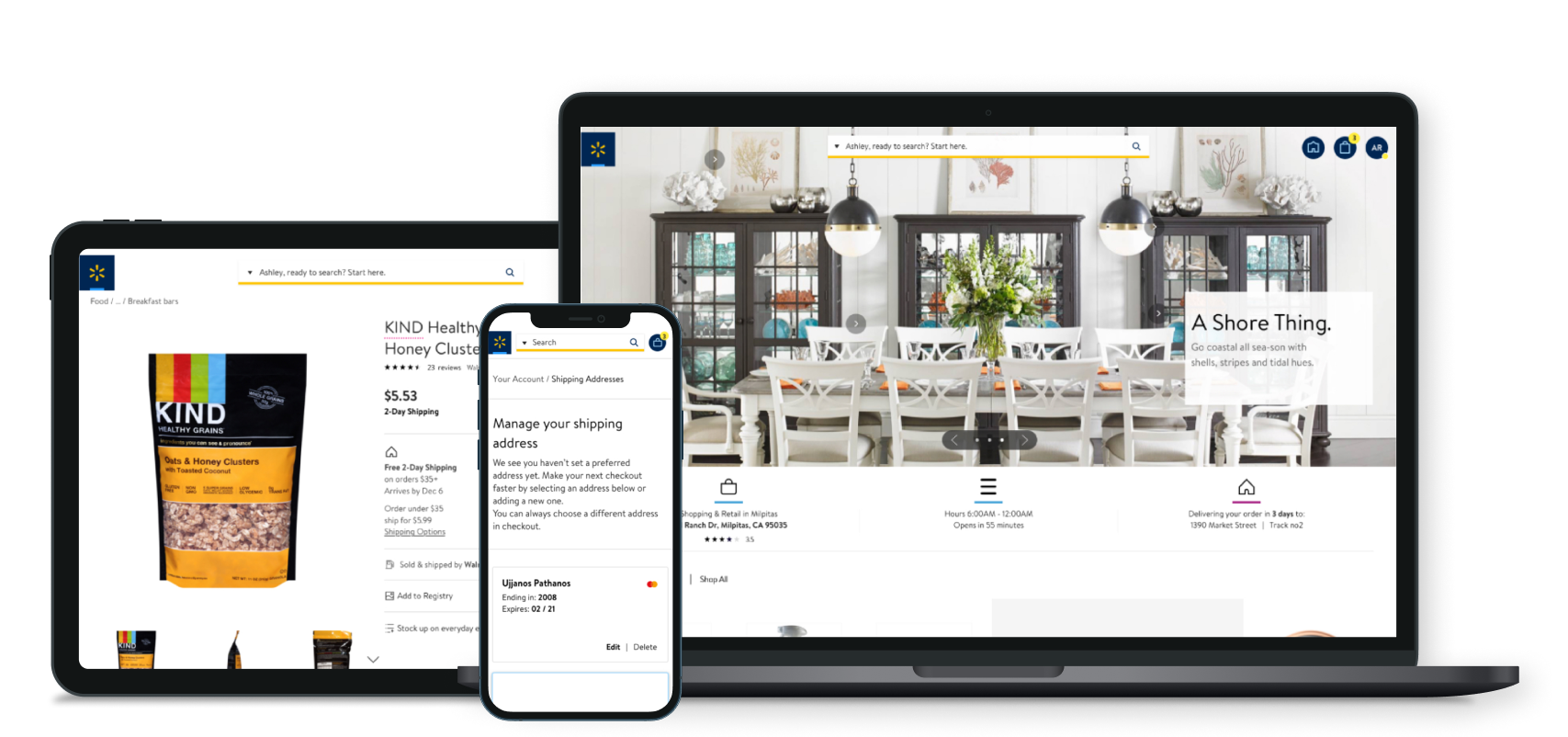
Displays a grocery shopping website on three devices: a smartphone, a tablet, and a laptop. The website shows a bag of KIND Honey Clusters cereal on the tablet, a search bar on the smartphone for managing shipping addresses, and a home interior dining room scene on the laptop.

Before and After

With a new design direction, it became cleaner and more modern digital shopping experience.
Walmart website featuring baby stroller promotion with free 2-day shipping, showing a purple stroller.